Interacting with Graphs and Tables
Most of the data presented in these dashboards is dynamic, meaning graphs and tables will update based on filters that you apply and/or elements within graphs that you select. Below are come examples of ways you can interact with this data.
Refining data
"Clicking" and "hovering" are ways to extract more data from these visuals.
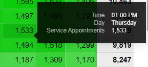
Bar graphs
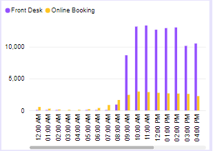
- Hover over a specific bar to view details on that data.

- Select a specific bar in a graph to update the dashboard to that data (for example, select the Front Desk bookings bar on 9 am to update the dashboard to "Front Desk bookings at 9 am").
- Select a specific month-year, day, or time from a graphs' x-axis. For example, select Tuesday from the x-axis to update the dashboard to "Front Desk and Online Booking data from Tuesdays during the date range."
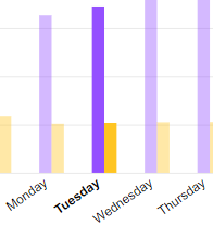
- You can also select items via the graph legend to view data related to the selection.
- Select multiple data points in the graph by holding Ctrl on the keyboard as you click, or by clicking and dragging a box in the graph.

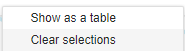
- Clear selections that were made within a graph by right-clicking within the graph and selecting Clear selections.
Line graphs
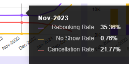
- Hover over a data point to view specifics on the data from that month-year.
- Select a data point to update the dashboard to that month-year. You can also select month-years from the x-axis.
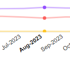
- Select multiple data points in the graph by holding Ctrl on the keyboard as you click, or by clicking and dragging a box in the graph (shown below).
- Clear selections in a graph by right-clicking within the graph and selecting Clear selections.
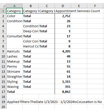
Tables
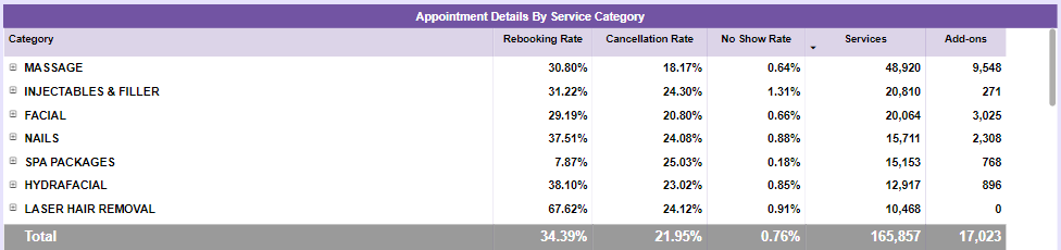
To interact with this table, you can:
- Select a column header to sort in descending order (most to least); select it again to sort in ascending order.
- Hover over a cell to view a summary of that data.
- Select any row in the table to update the dashboard to that selection. Make multiple selections by holding down Ctrl on the keyboard while selecting rows.
- Take a deeper dive into the data by selecting the + beside a Category and selecting one or more sub-categories. Refine the data even further by selecting the + beside a sub-category and drilling down to individual items.
- Clear selections you made in a table by right-clicking and selecting Clear selections.
Heatmaps
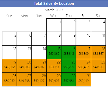
- Hover over a cell to view details on the data.
- On some heatmaps, you can select an individual cell to update the rest of the dashboard to that data.
- Clear selections by right-clicking and selecting Clear selections.
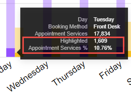
Viewing proportions
Often times, clicking an element within a dashboard will allow you to see its proportion to totals on other graphs. For example, selecting a specific Service Category from a table will update other graphs to data for that category. Here we see the total number of services from the selected category (1,609) and its percentage of the total (10.76%).
Applying multiple filters at once
As you select elements in a graph, the rest of the dashboard will automatically update to present data specific to your selections. To apply more than one filter at once, hold down Ctrl on the keyboard as you click. This is a powerful tool for refining data, as you can use this technique to "stack" filters further and further, refining the data with each click.
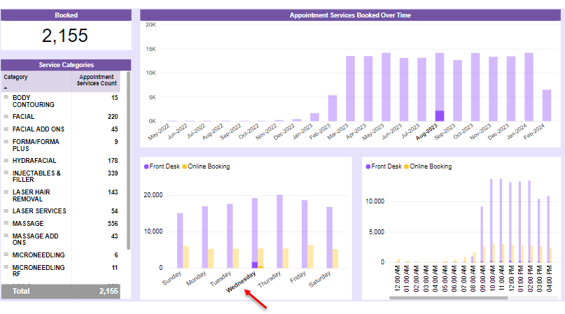
Appointment Bookings example
Select the Aug-2023 bar in the Booked Over Time graph to update the rest of the dashboard to booking data from that month-year.
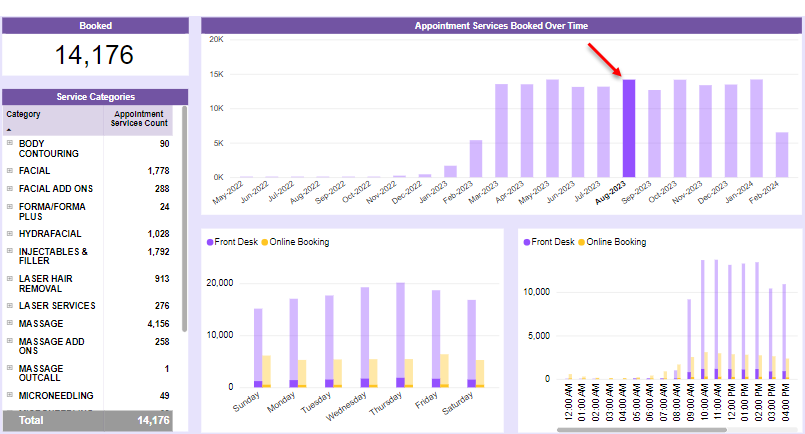
Then while holding Ctrl on the keyboard, select Wednesday in the Day of Booking graph to update the dashboard to display "appointment services that were booked on Wednesdays in August of 2023."
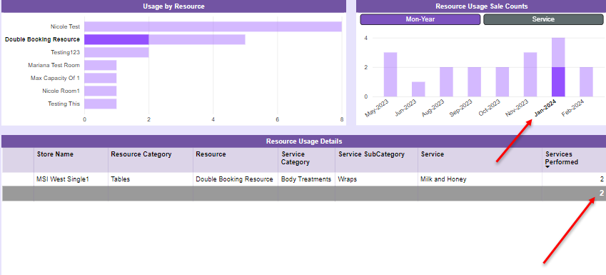
Resource Usage example
Select a resource in the Usage By Resource graph to update the rest of the dashboard data to that selection.
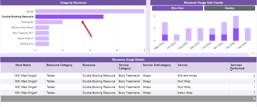
This allows you to see the number of those resource sales in proportion to the totals in the Resource Usage Sale Counts graph.
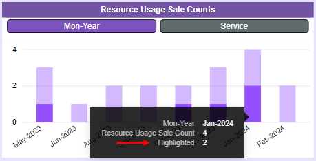
Then while holding Ctrl on the keyboard, select a month-year from Resource Usage Sale Counts to see specifics on which services were booked in that resource during that month in the Resource Usage Details table.
Client Leaderboard example
Select the Male row in the Sales by Gender table to update data to sales from men. Then while holding Ctrl on the keyboard, select a ZIP Code to update the data (including the Client Details table) to "sales from men from Zip Code 78660."

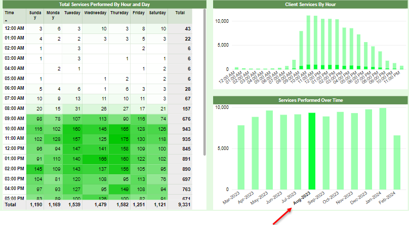
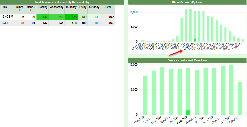
Client Traffic example
Select the Aug-2023 bar in the Services Performed Over Time graph to update the rest of the dashboard to client service data from that month-year.
Then while holding Ctrl on the keyboard, select a time of day (like 12 pm) in the Client Services By Hour graph to update the dashboard to display "appointment services that took place on at 12 pm in August of 2023."
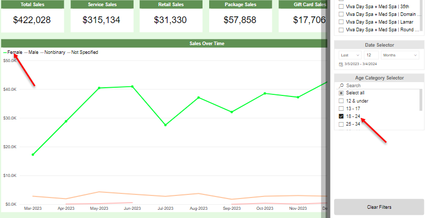
Client Demographics example
Select an Age Category (like 18-24) from the filter slideout to update the data to "sales from 18-24 year olds, all genders." Then while holding Ctrl on the keyboard, select Female from the graph legend to update the graph to "sales from 18-24 year old females."
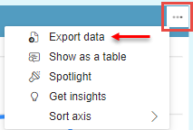
Exporting data from a graph or table
To export data in a table format:
- Select the ellipsis in the top-right area of the graph or table and select Export data. This is a more customizable method of exporting than the Show as table option in that menu.
- Choose one of the available export formats:
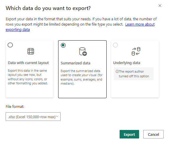
- Data with current layout: This option is only available for tables and matrices like a heat map. It exports the data exactly as it appears on-screen, including any specific data you expanded, but without any color or formatting. Only the .xlsx file format is supported for this option.
- Summarized data: This exports a complete record of the data regardless of whether items were expanded or not. This option also allows you to choose a file format (.xlsx or .csv).
- Select Export when ready. Your browser will download the file to its default "save" location.